Contents
- Finally, we caught up with Callie Hegstrom!
- 1. How did you get started with design & typography?
- 2. What is your inspiration?
- 3. What is an average day like for you?
- 4. Apart from design, what are your other hobbies?
- 5. Out of all your Typefaces, which one was the most challenging to create, and why?
- 6. What is your personal approach to kerning?
- 7. Who is your favourite artist and why?
- 8. What software would you recommend for font creation?
- 9. What advice can you give to other aspiring designers?
- 10. In one word, sum up your thoughts on Comic Sans…

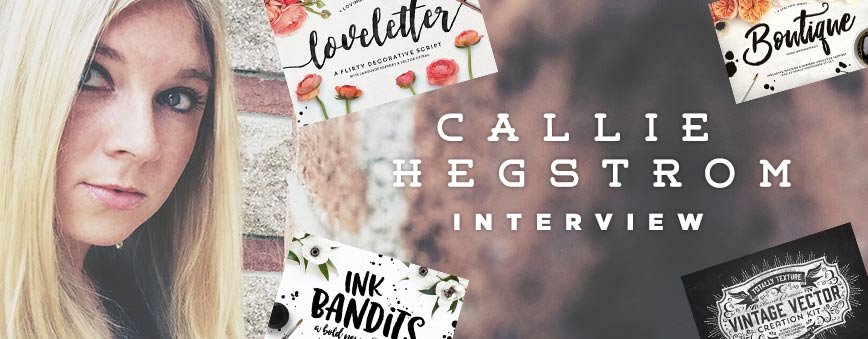
Finally, we caught up with Callie Hegstrom!
Yes! Today’s interview features one of the most popular designers on Creativemarket, in the form of Callie Hegstrom of MakeMediaCo. We managed to grab her for 10 mins and ask a few questions, including the oh so important question of her thoughts on Comic Sans! 😉 So without further delay, lets see what she had to say:
1. How did you get started with design & typography?
I’ve been illustrating and drawing letters since I was a kid, but largely gave it up early in my career. After I started designing products for Creative Market, I noticed a movement in hand-lettering, and I wanted to give it a shot. So, I bought all the necessary supplies, and started practicing. It was new, exciting and pretty challenging. What started as a hobby for Instagram, soon evolved into font-design. It was something I never expected, but turned out to be some of the most fulfilling work I’ve ever done.
The possibilities are pretty limitless in font design too. The key for me is continual practice, and experimentation with new mediums and techniques. I’ve come a long way, in a short amount of time, but I still feel like I have so much more to learn. To say I’m addicted, would be an understatement.

2. What is your inspiration?
I find inspiration just about everywhere I go these days. I’m generally multitasking with a 4-year-old, so when we’re out, I take snapshots of inspiring work, so that I have a visual reference later on. I also spend a decent amount of time in card shops and boutiques, as well as saving ideas on Pinterest. I take note of new lettering styles, color combinations, quotes, trends, etc. And once I get an idea of what I want to design, I have tunnel vision on that project (and only that project), until I’m done.
3. What is an average day like for you?
I love being a designer, but my first job is being a mom. Apart from a few hours of preschool each week, I spend almost all of my time with my little guy. Then when he goes to bed, my day really starts. Generally at 9pm, I finally sit down to answer emails, and fit in a little work…Unless my husband is home, and then the schedule completely changes. Basically, my days never look the same. It’s a fun, little juggling act over here, but it’s worth it.
4. Apart from design, what are your other hobbies?
Hmmm…hobbies. Does ‘design’ count as a hobby, if I’m already a designer? Ha ha. When you have a small business and a small child, there’s not much time left for hobbies. My business is constantly on my mind, so when I’m not designing, I’m thinking about what I’m going to do next, how to promote my company, updating my website or how to cultivate the latest trend. Having said that, when I do get a break, I like to hike and travel with my family, (and my trusty camera). Most people don’t know this, but I’m also an amateur photographer. I even have a separate Creative Market shop dedicated solely to stock photos. Of course I’d like to spend more time adding pics, but that would require a clone, a 12-hour workday, or an extra set of hands. 😉 Right now, I just do it for fun.
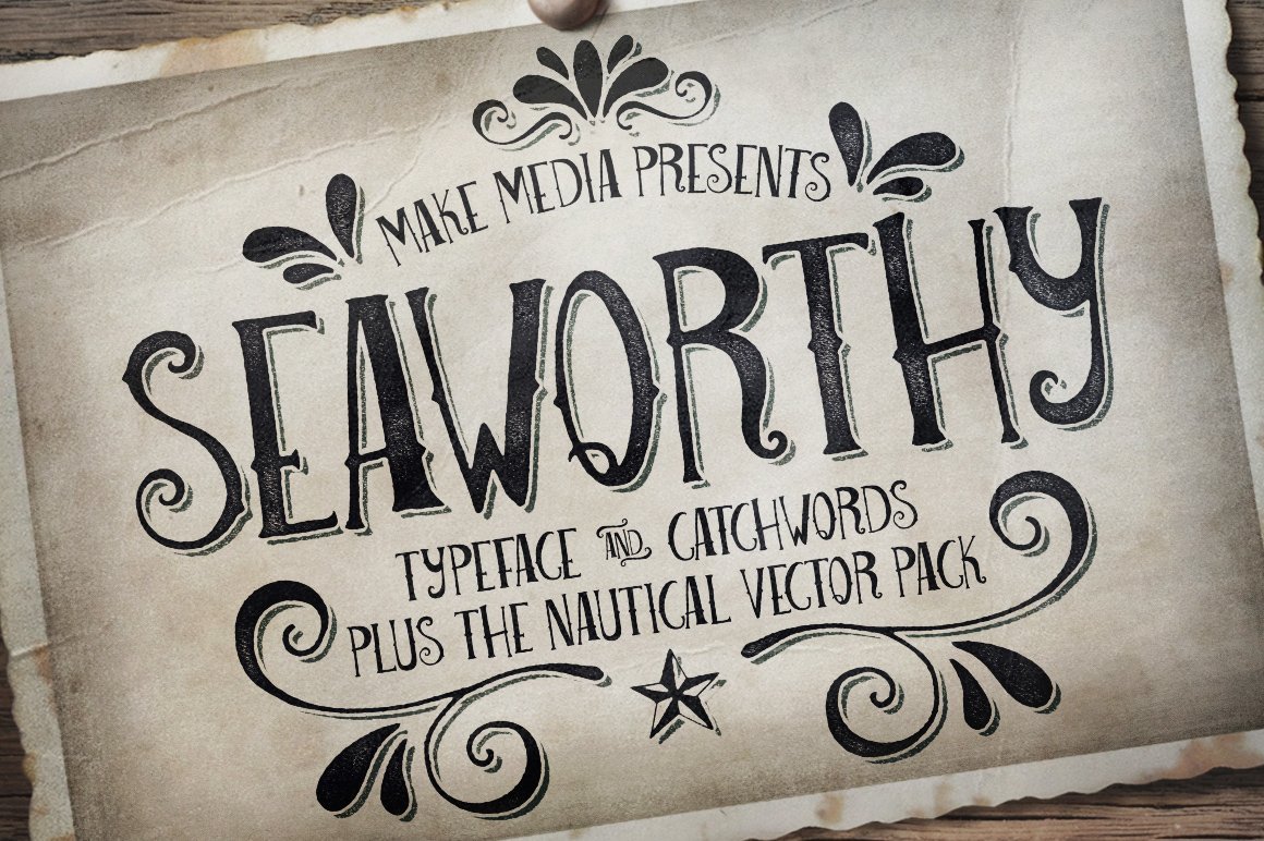
5. Out of all your Typefaces, which one was the most challenging to create, and why?
My first font, Seaworthy, was pretty challenging. Mostly because everything was new – the software, the medium, the techniques, etc. It was just foreign territory for me, and rather intimidating too.
But once I was finished, and I had a fully-functional typeface, I was hooked. Now I feel like each new font becomes more and more intricate. My current project is hands-down, my most ambitious. I’m really taking my time on this one. I want my time and energy to show, so I don’t want to rush it. Besides, ‘slow and steady wins the race,’ right? 😉
6. What is your personal approach to kerning?
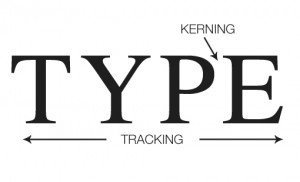
I’m not going to lie, kerning is my LEAST favorite part of the process. Just when you get your font prepped and imported (which can take weeks/months), the real work begins.
Kerning correctly is a lengthy (and mind-numbing) process for me, but it’s all part of making a beautiful font. The secret to minimizing your kerning work, is adjusting your side bearings correctly. If you set that up right in the beginning, then you’ll run into fewer problems down the road.
7. Who is your favourite artist and why?
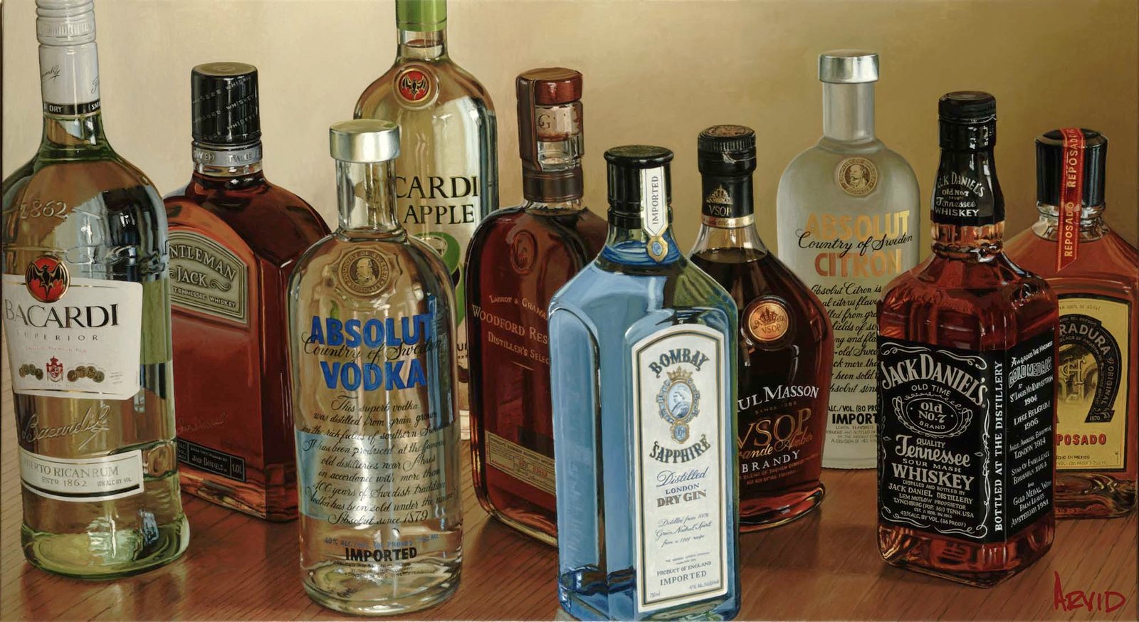
In college I was obsessed with realist painters. Probably because I can’t paint. 😀 Even today, I’m still impressed by those who can bring a canvas to life. In regards to painting, I have a particular affinity for Thomas Arvid. I was first introduced to his art about 10 years ago, and instantly fell in love with his work. (If you’ve never seen his wine paintings, check them out. It’s super-impressive stuff).
However, I also think it’s healthy to find inspiration in your own field, as well as from your peers, so I’m always checking out other hand-lettering artists and typographers. I’m continually impressed by the work over at Yellow Design Studio, as well as the chalk lettering from Dana Tanamachi. I consider both to be pioneers in their field.
8. What software would you recommend for font creation?
There are so many software options out there, so it really boils down to what you’re most comfortable with. I’ve seen some pretty impressive work with Birdfont, Glyphs, FontLab Studio, and others. Personally, I’ve found a balance between Glyphs and Fontographer. I use both programs in tandem, mostly because they both offer different features that I like. I can’t say this is the most efficient way of doing things, but it works for me. Both programs were an investment, but I know there are free options out there. So if you’re new to font design, don’t think you have to shell out top dollar for high-end software. Start with something like TypeTool or BirdFont, and see where it goes.
9. What advice can you give to other aspiring designers?
Start now. I was terrified of rejection early on, so I waited…and waited…and waited, until I felt like my work was ‘good enough.’ But what is ‘good enough?’ Art is so subjective. You just never know how people will react to your designs until you put them out there. So, stop worrying. Just do it. If you’re anything like me, you’re going to get rejected. My first 3 submissions on GraphicRiver were turned down. But I just keep designing, and re-submitting my work, until I got that glorious, ‘thumbs up.’ And that, my friends, was the beginning of something beautiful. If not for the rejection early on, I don’t think I’d be where I am today. So, just put it out there, and see what happens. You’ve got nothing to lose.
10. In one word, sum up your thoughts on Comic Sans…
LOL 😉
That’s a wrap, folks!
Thanks Callie for letting us know a little more about you and your work, its been a pleasure! 🙂
Leave a Reply
You must be logged in to post a comment.