Contents
- Type Lovers Rejoice! Mr Parrett is Here..
- 1. How did you get started with Typography?
- 2. What is your inspiration?
- 3. What is an average day like for you?
- 4. Apart from Typography, what are your other hobbies?
- 5.Out of all your Typefaces, which one was the most challenging to create, and why?
- 6.What is your personal approach to kerning?
- 7. Who is your favourite artist?
- 8. What software would you recommend for font creation?
- 9. What advice can you give to other aspiring designers?
- 10. In one word, sum up your thoughts on Comic Sans…
- That’s a wrap folks!
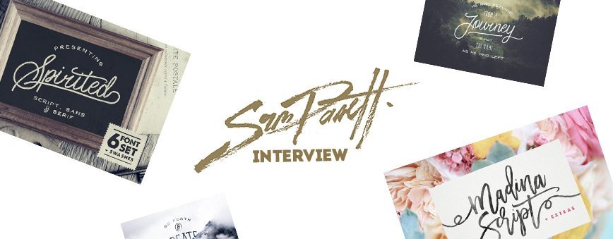
Type Lovers Rejoice! Mr Parrett is Here..
Here at Layerform we love to recognise fresh talent, and British Artist Sam Parrett has really burst onto the scene this last year showcasing some of the very best Script & Brush Fonts of 2015 & 2016 already. We managed to catch up with Sam recently and pick his brain on a few topics, and we also received his succinct one word opinion on Comic Sans!
1. How did you get started with Typography?
I actually kind of fell into it which I’m incredibly thankful for! Graphic design in general had always been a big passion of mine, and I decided to take the plunge and go freelance in 2010. I setup ‘Set Sail Studios’ which was primarily focused on designing logos, album artwork & merchandise within the music industry. Working across such a wide range of genres gave me a platform to explore different typography styles and I managed to pick up some really valuable skills and work with some awesome bands & people. I started designing fonts as a little side-project to turn a rejected logo concept into it’s own typeface (now known as ‘Sickamore’).

I didn’t really expect anything to happen from it and just took it as a learning experience, but it ended up being quite popular; it’s recently been spotted on the title graphics for WWE shows which is pretty surreal having grown up watching it.
I loved the whole process from start to finish and instantly had a head full of ideas for new releases, so recently decided to focus on them full time for a bit of a change of pace.
2. What is your inspiration?
I don’t like to tie myself down too much to a particular style, so I just try and draw inspiration in from wherever I can whether it’s from a video game, a film poster or just some elegant hand-lettering I’ve spotted out and about. I still like to draw inspiration from the music industry, sites like mintees are great for getting a quick-fix of trending design styles and feature some incredible artists in the band merch business. More recently though I’ve tried to broaden my style a bit – there’s a massive hand-lettering movement happening at the moment, and along with it some great inspiration feeds like good type & typespire have popped up which are guaranteed to get those creative juices flowing.
3. What is an average day like for you?
Well I work from my home office and have recently become a dad, so it’s not very rock & roll unfortunately, and any kind of routine has kind of been thrown out of the window haha. I’ll try and get up as early as I can and take my labrador Pixel (Sorry Sam, did you really call your Dog Pixel? Amazing!) out for a run, have a quick shower and reply to any e-mails and support requests before the rest of the house wakes up. Then I’ll join them for breakfast before starting whatever font project I’m working on – or if I’m in between fonts and struggling for a concept for my next release, I try not to worry too much and avoid rushing a font just for the sake of it.

There’s always other things which can be done in the meantime, like updating the website, free giveaways, video blogs and that sort of thing. I’ll usually wrap up by about 4pm, and then it’s flat-out baby entertainment for 3 hours until her bedtime, and this is when I have to get seriously creative – she’s harder to please than most design clients! I’ll finally get a few hours in the evening to chill with my girlfriend and watch some Netflix, we’re loving ‘Better Call Saul’ at the moment.
4. Apart from Typography, what are your other hobbies?
So as any parent will know, since becoming a dad I haven’t really had a huge amount of spare time for hobbies! But I do try and stay as active as possible because sitting in front of a computer all day, and working from home can make you feel a bit stir-crazy sometimes. I like to get out for a run every morning and take the dog on long walks when I can, I love the British countryside and just getting out in nature and away from technology can really clear your head. It’s definitely when I come up with most of my ideas and ‘eureka’ moments and really helps shift any creative blocks. I’m a bit of a gamer too and love the retro classics – there’s a couple of subtle references to a few of my favourite childhood games in my fonts!
5.Out of all your Typefaces, which one was the most challenging to create, and why?
When I was working as a freelancer I used Photoshop 90% of the time, so still feel like a bit of a newbie in Illustrator and other vector based programs. The majority of my fonts are traces from hand-letterings, but I’d like to explore cleaner & more digital methods so still trying to perfect my bezier curves. I recently released a totally clean cursive font ‘Ghost Type’ which was created solely from bezier curves in Illustrator – it was a pretty big learning curve and definitely the most challenging and time consuming. I think I’ve still got a long way to go with that style, but you’ve just got to jump right in and start creating rather than worrying or trying to learn everything first.

6.What is your personal approach to kerning?

I put on my kerning hat, take 3 long sips of tea, and shout ‘I FEEL THE KERN!’ as loud as possible. OK, that bit wasn’t totally true. Sometimes it’s coffee. I actually don’t have any kind of set method for Kerning, I use Fontlab Studio 5 which has a really helpful Metrics window – you can just type out any sentence, then click & drag any of the glyphs to adjust the baseline and the horizontal spacing.
Because a lot of my fonts are hand-drawn rather than clean serifs or body fonts, I’m not super precise with the kerning because the whole idea is that they imitate a handwritten piece. I know some designers will use spreadsheets of every glyph pairing to reach kerning perfection (or kernfection as I like to call it), but I generally just paste in some ‘Lorem Ipsum’ generated sentences and make a few notes on what needs adjusting.
7. Who is your favourite artist?
I’m a big fan of Joshua Smith a.k.a. Hydro74, not only is he an amazing typographer and has a huge range of really bad-ass fonts, but his illustrations are incredibly detailed and uniquely striking. His super clean & intricate style is always one I’ve struggled with, and I think that inspires me even more. Also, his work is just down-right awesome – I mean, he draws stormtroopers wearing biker jackets for heaven’s sake.
8. What software would you recommend for font creation?
As mentioned previously I just dived right in the deep end with Fontlab Studio 5 – I don’t have a huge amount of experience with it as I’m still quite new to the font game, but it seems like a very powerful piece of software and it’s really easy to apply kerning and code in opentype features. It can be a bit daunting at first, and I’m pretty sure I only use about 20% of it’s potential functionality – but I quite like that there’s so much more to learn rather than being limited by it’s capabilities. I’d definitely recommend it for anyone who wants to get into serious font production, I’ve heard that Glyphs is a really popular alternative at a more affordable price, but I can’t comment on that as I’ve never used it.

9. What advice can you give to other aspiring designers?
I’m definitely no veteran in the design industry but I think I’ve taken away a few really key lessons which I’m happy to share! Firstly, it sounds obvious, but just keep working hard at it. Don’t worry about being as good as other designers, or not knowing enough, just knuckle down and put in the hours doing your thing. It won’t happen overnight, but if you enjoy it and keep churning out new work then the opportunities will eventually find their way to you and get bigger and better.

One thing I always try and do is improve my ability as a designer, no matter how small that step is. Whether it means learning an extra tool in a piece of software, or just how to draw a cursive ‘r’ – it’ll slowly add up to big noticeable improvements in your portfolio. Another point is to try and focus on what you enjoy doing and not get sucked into doing stuff that you don’t – you’ll find it far more rewarding and sustainable in the long term! I mentioned briefly about opportunities coming your way, and it’s not always a bad thing to say ‘no’ if it doesn’t fit in with your vision of what sort of designer you’d like to be. At the end of the day you should be the person in control of your own destiny.
10. In one word, sum up your thoughts on Comic Sans…
Sacrilegious!
That’s a wrap folks!
So we found out they key to being a successful Typographer is to call your Dog Pixel and become knee deep in Nappies! (sorry, American subscribers – Diapers!). If you would like to see more of Sam’s work, you can check out his website Setsailstudios or head over to his Creative Market Page
Leave a Reply
You must be logged in to post a comment.