
Contents
The Best Fonts to use on your Resume?
One of the most important aspects of applying for a job is your resume. The resume provides your potential employer with the first opportunity to interact with and try to discern the kind of person you are. The problem comes when there are too many job seekers and the recruiters don’t get enough time to go carefully through all the CVs they receive.
The best way to create a good impression on the recruiter is to ensure that your resume is well presented, and the font you use plays a crucial role in this.
The best font will prompt your future employer to pause and take a closer look at your Resume/CV. A carelessly chosen font, on the other hand, will cause them to brisk through your CV without learning a thing about you.
So what are the bests and worst fonts to use on your CV?…
Best fonts
The right font will help to make your CV more aesthetically pleasing and improve your chances of getting called for an interview. According to recruitment agencies and industry experts, the following are some of the best fonts to use on your resume:
1. Calibri
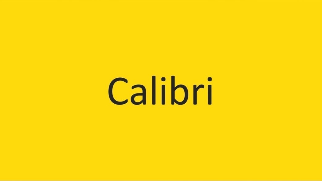
Calibri became Microsoft Word’s default font after replacing Times New Roman and has proven to be an excellent choice for CV writers. Many have described it as being current, professional, refined, and interesting to look at.
This sans-serif font is quite easy to read and was created by Dutch designer, Lucas de Groot. Professional CV writers and industry experts swear by it and explain just how seamlessly it renders on a computer screen. Calibri is definitely one of the best fonts to use on your resume out there.
2. Cambria

Cambria is a serif font that has remained a Microsoft Word staple since 2004 when it was created. This typeface was specifically designed to perform well on-screen when reading a text. It also looks good when it’s been printed in small sizes.
The sturdy character construction of the font ensures that characters remain readable even at reduced font sizes. You can use this typeface for both printed and online CVs.
3. Garamond

Garamond is a timeless serif font that would be a great alternative to the overly used Times New Roman. If you are considering a classical font style for your CV, this might be a good option. Garamond has been around for a while, with precursors being used as early as half a century ago.
The more modern version of Garamond provides you with an old-school yet polished option when presenting your resume.
Furthermore, Garamond allows you to fit much more text in a single page without compromising readability, by reducing the size of the font or the word spacing.
Envato Elements Fonts
Envato Elements is a Premium Design Assets Subscription service, supplying thousands of Premium Fonts from Top Designers. Envato Elements provide a significant array of different Fonts including Script Fonts, Handwritten, Sans Serif and Serif Fonts, Display Fonts and even SVG and Color Fonts. For these reasons alone, go ahead and check them out!
4. Didot

Didot is a classy and distinctive serif typeface that comes with an upscale look. If you are applying for a job in the creative industry-fashion design or photography- you can take advantage of this font to portray a bit of style and sophistication.
However, remember to use larger font sizes when you choose this typeface as the delicate serifs in Didot are most clear when applied in larger sizes. It would, therefore, be wise to use it for headings as opposed to the text body.
5. Georgia

If you want to have a traditional look on your CV that would be a better option than Times New Roman, you can try out Georgia and see how it works for you. The font has been suggested by some people for its a high readability since it was designed mainly to be used on-screen.
The characters and thick and clean; you won’t have to struggle reading a piece of text, even in small font sizes. The font style is also available on all computers.
6. Helvetica
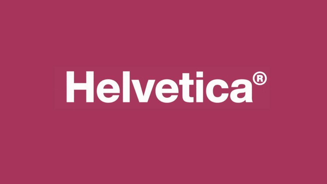
Helvetica is a contemporary, clean sans-serif typeface that has shown to be popular among typographers and designers. Many multinationals make use of this font on their logos including Panasonic and Jeep. Helvetica was created in 1957 by a Swiss designer named Max Miedinger.
Several of its variants have been released in a number of sizes, weights, and widths. It has a business feel to it and has been described as honest, lighthearted, and professional. It’s highly regarded as one of the best fonts to use on your resume.
7. Arial

Arial is another font should be considered for the best fonts to use on your resume. It is a great sans-serif font that many deem to be the safest bet. Industry professionals and employers like it for its clean lines and easy readability.
The characters are also bold enough to retain their clarity even when smaller sized fonts are used. However, you want to note that Arial typeface is becoming too common and some hiring professionals may be bored by it…not all!
8. Book Antiqua

Book Antiqua is a typeface derived from the classic Palatino font.
It has a gentle and distinctive style that would be an excellent selection for someone searching for a serif font as an alternative to the somewhat monotonous Times New Roman
Another advantage is that Book Antiqua is available in all Microsoft computers and has high on-screen readability. It will also make it easier for recruiters to learn something about you.
9. Trebuchet MS

If you think that there are too many people using Arial on their CVs and feel like you should get an alternative sans-serif font, then Trebuchet MS would be a nice choice.
This typeface was designed specifically to be used on-screen and has clear readability. It also has a modern look with a stronger texture than most traditional font styles used on resumes.
10. Avenir

This sans-serif font is a versatile option that you can use on your resume. It features a clean and crisp look that will elevate the presentation of your CV. There are also multiple weights that you can apply to differentiate various parts and features on your resume.
However, you want to avoid the “light and “book” weights because they may pose a reading challenge. The same is true for the condensed versions. You can also consider Avenir Next, which is an improved version of Avenir. It has better on-screen performance.
Worst fonts
Using the wrong font on your resume can really hinder your chances for getting the job. It seems a bit extreme, but logically speaking if your potential employer can’t even process what’s on your CV in the first place, how are they going to decide for themselves if you’re a good or bad candidate? It wont even be a thought to toss your CV in the trash.
Going by what recruitment agencies say, you might want to steer clear of the following font styles:
1. Times New Roman

This might comes as a surprise to you, especially when you consider how often it has been used by job seekers. The thing is, there’s actually nothing wrong with the font design, only that it has been excessively used to the point of becoming boring.
Employers have grown tired of seeing basically the same type of document as they go through applicants’ resumes. Not to mention that the font is hard to read through at small sizes.
2. Futura

Futura is a sans-serif font that was designed way back in the 1920s. The problem with Futura is that it was created in Germany and takes a more geometric form which may not sit well with employers. And although it may have a clean and attractive design, the overall look of the typeface may come across as atypical.
Features such as the uncharacteristically long lowercase letters and the harsh contrast between round letter shapes don’t help its case. Futura is more of a decorative font style, which is not a quality that employers are looking for on your CV.
3. Courier

The font was created to reenact a typewriter’s writing and later on picked up for use on electric typewriters. This quality, unfortunately, makes your resume appear like it was typed on a typewriter.
It doesn’t help when your CV looks like it was updated some three decades ago. Additionally, it is a monospaced font and may appear somewhat unusual, especially when used on a full page.
4. Comic Sans

Unless you are just waking up from a coma, you should know that Comic Sans is today considered the poster child of font choice DON’TS when putting together your resume.
It was created in 1994 to resemble the design of characters in speech bubbles common in the old comic books. It has a childish and casual look that removes the seriousness out of your CV.
This is not the effect you want on a document as crucial as a resume. The general rule of thumb for CV writing is that you should keep off any font styles that have a flowery, fun, funky, or flashy feel.
Conclusion
When you sit in front of your computer to write a resume, bear in mind that the font you use is a crucial first step to improving your possibilities of landing the interview.
You want to go with the best fonts to use on your resume to be able to highlight your competencies and capabilities.
Meanwhile, avoid using any undesirable fonts that you’ve been advised against, either way, we hope this list of the best fonts to use on your resume helped out!
Leave a Reply
You must be logged in to post a comment.